Thursday 20 October 2016

170 anniversary / mockup and submission

 Mockup of my final design in a magazine spread:


Following this, I emailed my design before the deadline and successfully submitted: 


170 anniversary / development

Continuing on with the development of the landscape, screenshots of the progress have been displayed below:


I felt it would be appropriate to add more buildings to give a sense of the scale of the city. The sign pointing towards Leeds was also a late addition but I felt this was fitting as the design is being created for Independent Leeds Magazine. The paths changed a few times throughout the development of the design. It didn't seem appropriate to have 1 path leading into the city and one leading off towards the right, so I created new paths that all led towards the city, making it the focal point of the image.


Moving into Photoshop, I edited the overall colours of the image. This colour scheme looks a lot more "magical" and exciting, creating the effect that Leeds is a bright, creative city. The final details were added in the last image, further expressing the theme of nature and future technology working together. The buildings and natural elements using the same colour scheme expresses this, as everything compliments each other and gives the effect of a utopia where everything works in harmony.

170 anniversary / initial ideas

To start off the design, I produced an initial sketch of the landscape I wanted to produce.


The design features the city being quite far off into the distance with a lot of natural elements leading up to it. The design is framed by two large trees in the foreground, which represent an emerging city working in harmony with nature. The buildings should look like the focal point of the image but not take away too much from the surrounding landscape.

The colour pallet should be quite minimal, i.e. limited to two or three colours with various shades. This will help make the idea of a utopian creative city more prominent within the design, as it strays from reality quite a lot.

Colour Pallet Ideas: 


A lot of the initial colour pallets have strong shades of blue/green. This was not done on purpose but the underlying theme of nature and wildlife is very prominent within my concept. 

Illustrator: 
To progress with my idea, the design needs to be moved over to Adobe Illustrator where the majority of the creating will take place. I decided to create the design with the first proposed colour scheme in mind, although this can later be edited in Photoshop. 


The initial landscape was started by arranging the composition within the correct sized document and starting to visualise the design on screen. 

170 anniversary / research

As the artwork is being displayed in Independent Leeds Magazine, I decided to take a look at the publication to see what it was like.


The magazine has a minimal, slick feel to it which is surprising as it is a free publication! The aesthetic of the designs are mainly flat, vector style which suits me pretty well. The brief states that the design should be a double page spread, and looking at the magazine it would work quite well as the pages can be opened fully and placed flat on the desk. 

As the concept for the magazine spread is 'creative city', I wanted to look into illustrations that reflected the idea of a utopian city. Many of these illustrations are striking with really creative ideas for the buildings and future technology.

I looked into multidisciplinary artist Sam Chivers, who creates illustrations with a theme of nature and future technology.


The textures that he uses in the illustrations give a really nice charm and add extra detail and depth. The colour pallet gives the impression of a world rich in nature and technology working together. Combining this theme of a utopian city with my already existing design style of vector landscapes, I feel I could create something that fits the brief and will look great in a magazine. 

Examples of the design aesthetic I can create:


Tuesday 18 October 2016

170 anniversary / brief


Brief
Independent Leeds magazine are working with Leeds College of Art on a special feature edition which will be launched on the evening of the 170 party at Leeds City Museum.

We would like you to create work for a double page spread in the magazine on the concept of the ‘Creative City’.

The artwork specifications for this are: 
370mm w x 271mm h, CMYK, 300ppi

You can submit the same artwork as the train station/170 event, but you would need to ensure that you can resize it to the correct specification and submit it at the correct resolution.

SUBMISSION DEADLINE:
Monday 24 October, 12 noon

Analysis
This brief is a really good opportunity to get work seen by the public and gain some valuable exposure. The brief is very open ended and gives a lot of room to come up with new ideas and underlying concepts. Independent Leeds Magazine is a free publication but has quite a high design standard. The work produced will have to fit in with their style and ethos. 

creative networks / feedback

Unfortunately our group wasn't selected to take forward with the Creative Networks branding. The feedback we received is as follows:

Posters
Strengths:
  • Strong visual impact and effective use of mosaic motif.
  • Mosaic bursting through works well with backgrounds here and doesn’t distract too much.
  • Clear consistent branding and message – easy to be replicated and develop.
Builds/Opportunities:
  • In regards to background images show of skill in interpretation of the speakers work – posters are used as a way to decorate / pieces of art and are often taken home by guests as a memento.
  • Risk of limiting amount of text / size of text to solely within the mosaic – text currently in would usually be the norm but depends on the speaker / agent’s preference.
Motion Graphic:
Strengths:
  • Nicely linked to posters / branding.
  • Personal / physical approach is refreshing.
Builds:
  • Could be slightly sped up / shorter with music cues to help settle the audience.
Overall I feel like our final presentation could have been articulated better and more slides could have been included to get our concept across more thoroughly. As for the poster feedback, we weren't aware of how they can be used as a memento for guests so this wasn't a considering factor. I agree with the majority of the feedback and feel that a fair decision was made. I think our group worked well together and the result is unfortunate, but the whole aesthetic of our design was something Creative Networks hasn't had before - so the risk we took this time hasn't paid off. 

Sunday 16 October 2016

creative networks / presentation boards

Below are the presentation boards our team submitted to the Creative Networks team. We included information about or concept, animation and possible developments we could apply to the project if chosen.


Friday 14 October 2016

creative networks / final animation

To create the final animation we made use of the photography studio and equipment. Shooting a stop-motion video is a lengthy process so we had to make sure we had planned our time efficiently due to the short timescale of the brief. 

The set-up in the photography studio included lighting and a camera facing vertically towards the surface. As we shot each individual frame, the discarded papers moved around organically to give it a different feel. There was quite a large amount of movement between each frame, giving it more of a DIY and friendly effect. 


The final animation is shown below. It mimics the poster designs which have layers peeling back to reveal more information about the event. The spot colour is also included at the very end where the speaker is shown. We hope to achieve a more approachable, fun and friendly outcome and hope that the concept of the paper being ripped away to reveal more information can be carried through to many more deliverables if chosen. 


Wednesday 12 October 2016

creative networks / poster designs

To create the posters, the image of the ripped paper was placed into photoshop and edited over the artists work. The colour in the logo is a spot colour relating to the artist and will change with each event. I created a version that included quite a lot of information in the Leeds College of Art logo:


Joel created a simplified version using a deeper red, and also created the poster design for LeedsInternational Film Festival with more succinct, simplified typesetting.


creative networks / practice animation

To see whether our stop motion idea was viable, we decided it would be useful to create a test animation. For the animation we wanted to have a more -hands on- approach and we used hand drawn type (stencilled from Karla Bold) to bring the concept together. 


The idea is that underneath each layer, more information will be revealed about the event, for example:

Welcome

Leeds College of Art

& Creative Networks

Presents

(Insert speaker)

The group is happy with this animation and will be continuing with this idea forward to a more substantial animation.

Monday 10 October 2016

creative networks / poster photography

With our concept in place, we moved onto designing the first aspect of the brief - the posters. The poster design will include the Leeds College of Art logo being torn out of the artists work, revealing key information about the event. The concept also shows how the talk is revealing more about the artist, and showing different layers to their personality and work. All of the posters will have the same layout to ensure continuity throughout the events and allow people to instantly know what the poster is advertising.  To capture the essence of the rips for the poster, we thought it would be best to create a real rip and photograph it to be later edited in photoshop.

Using black and white paper for the photography
will ensure easier editing and cleaner cut outs. 
Once the 3D paper rip had been photographed, the group also thought of how we could use this technique within the real posters. If chosen, we will look into the idea of producing the posters with real rips bursting out of the page. This will make them particularly more engaging and allow the underlying concept shine through.

Thursday 6 October 2016

creative networks / initial ideas

Working with Joel and Isla, we discussed ideas about what could work for the brief. The brief highlighted the idea of concept being crucial to the designs, so we wanted a constant theme and structure throughout the posters.

We looked at some of the previous posters provided on the brief and we liked the idea of using the tile from the Leeds College of Art logo and creating a mosaic of images promoting the selected artist. We went away and each created our own framework layout.
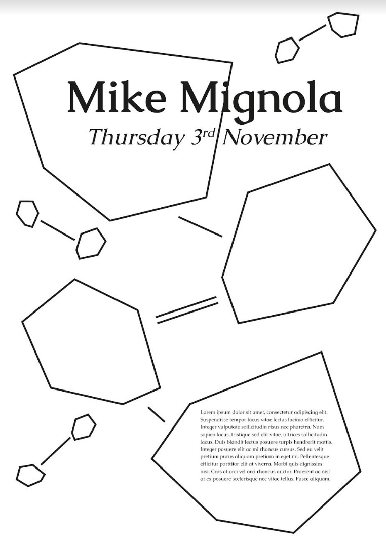
My Initial Ideas:


I mocked up a simple design using some of Mike Mignola's work to really capture his style. The middle shape (the only full logo shape that hasn't been cut off) includes the information of the event. This layout can be used in multiple different ways: 


Joel's Initial Ideas: 


Joel's ideas were focussed more on the layout of the tiles and text placement. The concept of connecting was also a big part of his designs. The shapes would provide an insight/story towards the chosen speakers processes and background. 

Isla's Initial Ideas: 


Isla brought this image along to our discussion and we all really loved it. We thought we could use the same technique of ripping the paper to reveal something underneath. For the main posters, we want to have the logo shape ripped out of the middle of the page showing the information for the event, with the artists work in the background. We feel this would be a really eye-catching design that has the important aspects of the poster in one, eye-catching place. 

We also discussed this technique and how it could be pushed further to create a stop-motion video. The paper would be continuously ripped off, revealing new information underneath. This animation could be used for social media, emails and before the speaker begins to present. The concept is interwoven with all the deliverables, which is a mandatory aspect of the brief itself.

creative networks / brief


Preliminary Brief
We want to see your work. Following the brief below, please provide a 1xA3 PDF designed for the next guest speakers. One design for Mike Mignola and one for Leeds International Film Festival with a guest speaker of your choice. This could be someone you would like to see at Creative Networks or someone you have seen speak.

Winners of the preliminary brief will continue to design for all Creative Network Events.

Project Description
Promotional material for five Creative Networks events. Creative Networks is Leeds College of Art's major external engagement event where high profile speakers from the creative sectors are invited to share their expertise to an audience consisting of industry, staff and students.

Requirement
The CEE team are looking for a small team of students (3 to 4) to help promote design material to be used at each of the five Creative Networks events happening this academic year. Each event is unique based on the guest speakers and flexibility with designs and concept is key.
The digital materials are needed a month in advance of the event to assist in promotion, whilst printed materials need to be provided by the CEE team as soon as possible and need to be printed a week before each event.

Brief analysis:
The Creative Network's brief is a great opportunity to brand a wide range of exciting events and gain exposure with experienced industry level creatives. In order to be chosen, we must provide artwork for the initial test brief above. If chosen to provide the designs for this brief, the project becomes a large undertaking. Collaborating is crucial to this brief. For this brief I will be working with Isla Pearce and Joel Sleet.