As the
existing Toulvaddie website is fairly basic and has the old branding, I decided to create a new version that appeals to my target audience. This will be part of my final outcome and will improve my web design skills.
Enter
Using Adobe Xd I began working on re-designing the existing pages of the website. The first page when you open up the new website will be an 'enter' page. This page's purpose is to build up suspense and display the logo proudly. The users must click anywhere on the page to enter the site and view the home page. An enter page keeps the experience fresh for the users and exposes them more to the brand.
Navigation
The navigation of a website is crucial to it's success. If users cannot find their way around the website or access information easily they will become frustrated and even leave the site all together. The user having a good experience on the site is key and will strengthen their relationship with the brand. I have kept the simple navigation bar at the top of the page, which will be displayed on every page allowing ease of use. This will avoid any confusion as the information is clearly displayed and accessible.
I have decided to remove one of the original pages, 'our stills' and replace it with 'cocktails'. The reason being that there is not much information about the stills on the current website and within my research I found that my target audience would like to hear more about cocktails.
Homepage
The current homepage is where users can sign up to join the newsletter and also features an introductory statement about the distillery. I have decided to keep these aspects of the homepage but change the way the information is presented.
 |
| Current Website |
 |
| New Design |
I have also ensured that the images displayed on the site are relevant to the brand and show off the product as much as possible.
Our Journey
This page has a lot of text and basically describes how Toulvaddie was formed. This focusses mostly on Heather Nelson - the founder and has a lot of text written by herself. I wanted to keep this page personal yet functional, and tried to keep the images relevant to what was discussed within this section.
 |
| Current Website |
 |
| New Design |
The images break up the text and allow the user to read the lengthy amounts of text with ease as the eye naturally follows the columns.
Cask Ownership
A function of this site is also purchasing items. As Toulvaddie is a new distillery, users have the option to purchase casks for £2,000. As the current website uses the current logo, I created my own version of what the cask would look like:
 |
| Current Design |
 |
| New Design |
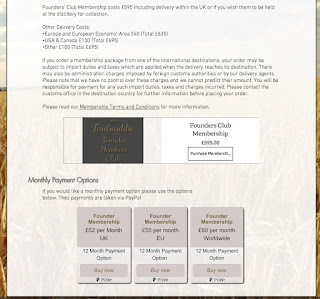
Founders Club
Users also have the option of becoming a member of Toulvaddie, and as the distillery is brand new it allows them to be part of the brands history. This page is also very text heavy as it explains the payment options and what members will receive. My design condenses this information and breaks up the page with another image of the whisky its self.
 |
| Current Design (Part 1) |
 |
| Current Design (Part 2) |
 |
| New Design |
Shop
As users are able to make purchases through this website, the shop page collates all of these aspects into one place. This will most likely be expanded once the distillery has grown and is producing whisky. The designs are fairly similar but the new design is utilising the branding I have created to produce a page suitable for my target audience.
 |
| Current Design |
 |
| New Design |
Contact
This page allows users to contact Toulvaddie directly through the website. It is important that information is displayed clearly and is made as accessible as possible. Again, the new design is fairly similar to the existing design though utilising the new branding.
 |
| Current Design |
 |
| New Design |
Cocktails
This page doesn't feature on the existing Toulvaddie website, though I felt it was important to the target audience and overall re-brand of whisky as a drink itself. Cocktails are increasing in popularity and they make alcohol more versatile and fun. Within my research I found that my target audience would be more willing to try whisky if cocktail recipes were made readily available to them. Within the new Toulvaddie website I have dedicated a section to cocktails and how to make them:
Navigation Demonstration:
Adobe Xd allows you to record the site in use. I have created some short clips which are shown below:


