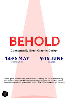
The image shown above was my initial thought, though we decided to be more bold and eye-catching with our colour scheme and typeface choices.
This poster design has a more mysterious and sci-fi feel, especially using the green colour. The spotlight was further developed into a more soft, blurry grain and we decided to make the title stand out more by not giving it a drop shadow and using one solid colour. The typeface choices are contrasting in style to give a sense of grandeur but also a contemporary feel which represents the variation of work within the college.
Lo created a smoother grained spotlight which matched the aesthetic:
The final layout is more contemporary with the use of the type aligned down the edge of the poster. We also moved the LCA logo to the top of the spotlight, showing that all of the hard work and dedication to our respective courses has come from the university its self.
The poster reads: "Behold - unforgettable final year students". We thought that the play on words could work well throughout the exhibition, and we decided to create phrases for each of the courses:
Behold -
Phenomenal Graphic Design
Extraordinary Animation
Incredible Creative Advertising
Astounding Fashion
Remarkable Fine Art
Inspiring Illustration
Brilliant Photography
Marvellous Printed Textiles
Spectacular Visual Communication
Unforgettable Final Year Students


No comments:
Post a Comment